By Raul Elizalde
From the March 2009 low of 676, at the depths of the financial crisis, the stock market rose more than tenfold to today’s levels just short of 7000. From the March 2020 bottom, at the height of pandemic panic, it has more than tripled.
One obvious lesson is that the darkest moments often come just before dawn. A practical translation is that selling all your stocks at peak market terror is usually one of the worst moves you can make for your financial future. Taking the opposite view has historically paid off. Warren Buffett captured it well: be fearful when others are greedy, and greedy when others are fearful.
But how do you know things can’t get worse?
At the worst point of the 2000–2002 bear market, the S&P 500 was down almost 50% from its prior peak. Investors were fearful after the initial 20% drop, but should you have been greedy then? What about when it was down 30%? If you took the contrarian stance at either point, you had to endure significant further losses before the market began to recover. This ties into another rule of thumb: don’t try to time the market. Being greedy doesn’t mean betting the farm on that sentiment.
The same applies on the way up. From 1987 to 1997, the S&P 500 quadrupled. Investors were clearly enthusiastic as gains accelerated. If you had decided to “be fearful” and lock in profits at the end of 1997, you would have missed another 55% climb to the peak in 2000.
All of this underscores a simple truth: nobody knows what the future holds. “Past performance is no guarantee of future results” isn’t just legal boilerplate mandated by the SEC; it reflects reality. Year after year, the SPIVA study from Standard & Poor’s shows that professional managers who outperform in one year rarely sustain that performance for long. There’s no reliable link between past and future results.
So what should you do?
Market forecasts are often compared to weather forecasts. While meteorology has improved dramatically, no one can say in January exactly what the weather in Chicago will be on any given day in July. Still, it’s a safe bet that it won’t be colder than the coldest day in January. History may not tell you what to wear on Independence Day, but it gives you boundaries.
Similarly, 75 years of market history can offer clues about when fear or greed may be reaching extremes.
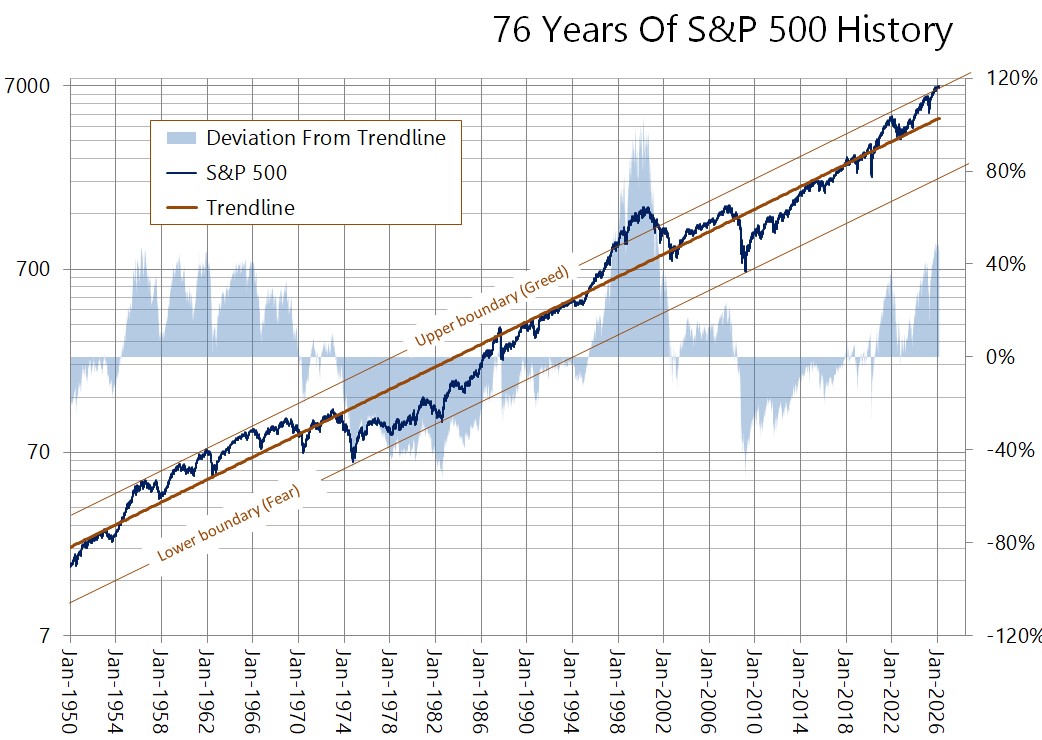
The S&P 500 was launched in 1956. Standard & Poor’s, the index owner, backtracked the calculation to 1928. But the early decades unfolded under very different conditions: no federal deposit insurance, the constraints of the gold standard, weak regulation, and two world wars. Leaving that era aside, a pattern emerges: the index rises steadily along an exponential trend (which appears as a straight line on the logarithmic chart below). Deviations above and below that trend have generally been contained, with a few notable exceptions. And those exceptions mark the extremes of fear and greed that may help make sense of longer-term trends.
 source: Federal Reserve Bank of St. Louis
If we view the upper boundary above the trendline as a line of exuberance, the first major episode of greed came around 1958, when the index reached its largest departure above trend. That didn’t last long: a year later, it fell 20% from its peak. What followed was a volatile stretch: a 28% drop in 1962, a 22% decline in 1966, a 36% slump in 1970, and a 48% collapse in 1974. A bear market arrived roughly every four years, marking one of the most punishing periods in market history. After each of those declines, a move back to the upper boundary followed.
But the 1974 trough was different. It touched the lower end of the range—a truly “fearful” point. From there, the index rose fivefold by 1987. That year saw the worst one-day drop in history, a 22% plunge, yet the market was not at an exuberant extreme according to this framework. It continued climbing well into the late 1990s.
Then came the late-1990s dot-com bubble. Starting in 1998, the index pushed deep into euphoria, and it didn’t end well. The subsequent collapse from 2000 wiped out almost 50% of its value but only brought the market back to trend. It wasn’t until 2008 that the index again hit a true panic extreme at the lower boundary.
The broader takeaways from this quick history of the S&P 500 are that (1) the market’s long-term direction follows an exponential path, which is to be expected in growing economies with expanding populations, and (2) although prices stray from that trend, there are limits to how far and for how long.
Which brings us to today.
By this framework, the market appears as expensive as it was in the late 1990s and even more so than in 1958. Could it go higher? Of course. It is possible to make convincing arguments for continued gains – and markets can always overshoot, as they did from 1998 through 2000. What does seem clear is that, in historical terms, the odds of further gains don’t look particularly good. Today’s levels do not appear to be an especially attractive entry point.
As we write this, the list of possible trigger points for a downturn keeps growing (wars, inflation, recession, oil supply disruptions, AI disruptions, etc.). In that sense, a move back toward the trendline might be more likely than a push to even higher levels. This does not need to materialize as a sudden crash of 30% or more; it could also take the form of a long, volatile, and directionless plateau. Many other factors will come into play as well, such as liquidity. One way or another, this might be the time to protect some of the huge gains made over the last six years. This is not the best time to be greedy.
Questions?
Talk to us.